ASTROVISION AND THE COLOR OF MONEY

For some reason, I keep returning retrospectively to Scorsese's low-key sweet spot period from After Hours (1985) through The Color of Money (1986) and ending somewhat informally with Life Lessons (1989) from New York Stories.
I see those three specific titles as somehow pivotal to preparing for Scorsese's monumental career renaissance from Goodfellas (1990) onwards, where both his commercial value and critical reputation were harmoniously aligned and seemingly assured ever since.
It occurs to me that through the 1980s, Scorsese was marking time in a hostile commercial climate, trying determinedly to remain an auteur at a time when marquee blockbusters dominated the box office and left very little in their wake except a trail of empty popcorn boxes. Though The Color of Money was a commercial and critical success, controversy two years later with The Last Temptation of Christ created more volatility and insecurity for the Italian- American director.
Yet amid all this artistic and commercial uncertainty, the 1980s experiments (in collaboration with DOP Michael Ballhaus) equipped Scorsese with a new lexicon of cinematic vocabulary, preparing him to thrive in a more sympathetic 1990s climate in which independent auteur sensibilities could coexist with larger commercial profitability.

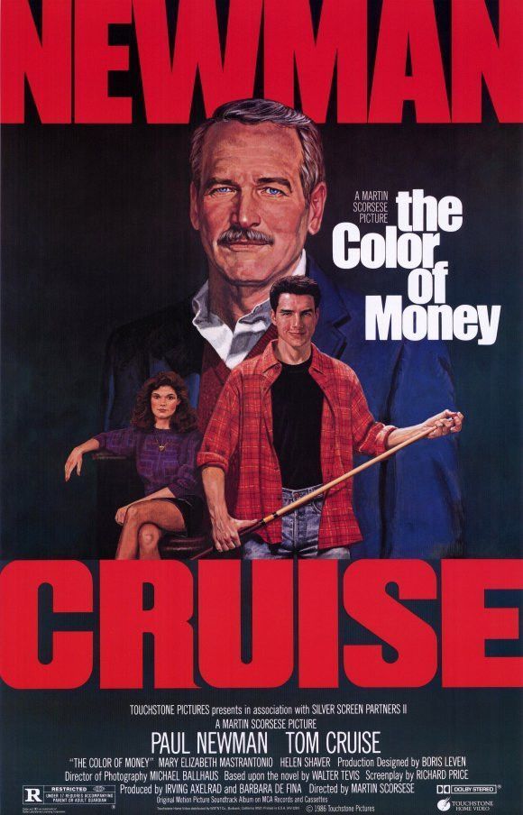
My introduction to Scorsese, however, was not by watching one of his films but admiring the illustrated poster for The Color Of Money which hung like a Rembrandt on a wall of Astrovision, the much beloved local video store in my local Cotswolds town when I was kid.
Back then, the place was as much an art gallery to me as it was a place to rent your favourite movies. I didn't need an elevator pitch on the back of a chunky VHS box to encourage me to rent a film; I just needed those warm, colourful looking 1980's film posters rendered from pencils, ink and paint and I was sold.
From the aged parchment looking Raiders of the Lost Ark poster, to the Michelangeo referenced image of E.T with his long, alien finger reaching out to Elliot's fleshy human hand, these iconic illustrations became embedded into the cinematic aesthetic of the age and the psyche of nearly every child growing up through the 1980's video store era into the 90's.
And although the artwork for The Color Of Money poster doesn't hold up alongside those aformentioned illustrated greats, there was somehow a divine synergy between its soft portraiture of Newman, Cruise and Mastrantonio and the video store atmosphere of Astrovision that struck me as an extension of the film itself.
A low lit emporium, Astrovision was similar to an old pool hall, with musty carpeted floors and a wide array of confectionary and soft drinks to hand and a few hang dog looking dropouts scouring the shelves in search of redemption in the form of a film they could rent out, anything so they could escape the monotony of their lives or maybe just a Sunday afternoon.
The dream of Hollywood here was as tangible as if walking Sunset Strip itself. For just a pound or two, we'd have the latest titles to take home with us and feel a smug sense of ownership for 24 hours until we had to return it or else incur a late fine.
I even remember the thick colour-coded plastic cases for video cassettes to indicate the certifcation of each film you rented: green for U, yellow for PG, white for 15 and red for 18. Not just any old red either, a bright clotted blood red that stuck out like an ambulance siren should you be caught renting a title beyond your legal years. Inside each of the cases was a sort of corrugated plastic lining that ensured the safety of the videos as you took them home. These details may seem inconsequential in the hyper convenient digital age, but somehow the tactile aspect of the boxes felt important back then in the ritual of taking a film home with you. There was a sense of value attached to the precious cargo we carried even if the films were essentially B-movies such as Troll (1986) or The Dirt Bike Kid (1985).
If I had to reconstruct the old place now (put out of business with the arrival of a Blockbuster video store) with just a few rental titles from that time, it would probably be Trading Places (1983), The Goonies (1985), The Golden Child (1986), The Color of Money (1987) and Coming To America (1988) for some reason I've yet failed to identify.
And now, having recently revisited The Color of Money decades later on DVD, I find it immediately creates an instant Proustian sense of remembrance for me of that halcyon time growing up when renting movies was a portal to my dreams of belonging to film in whatever permeation of its world I could find for myself.
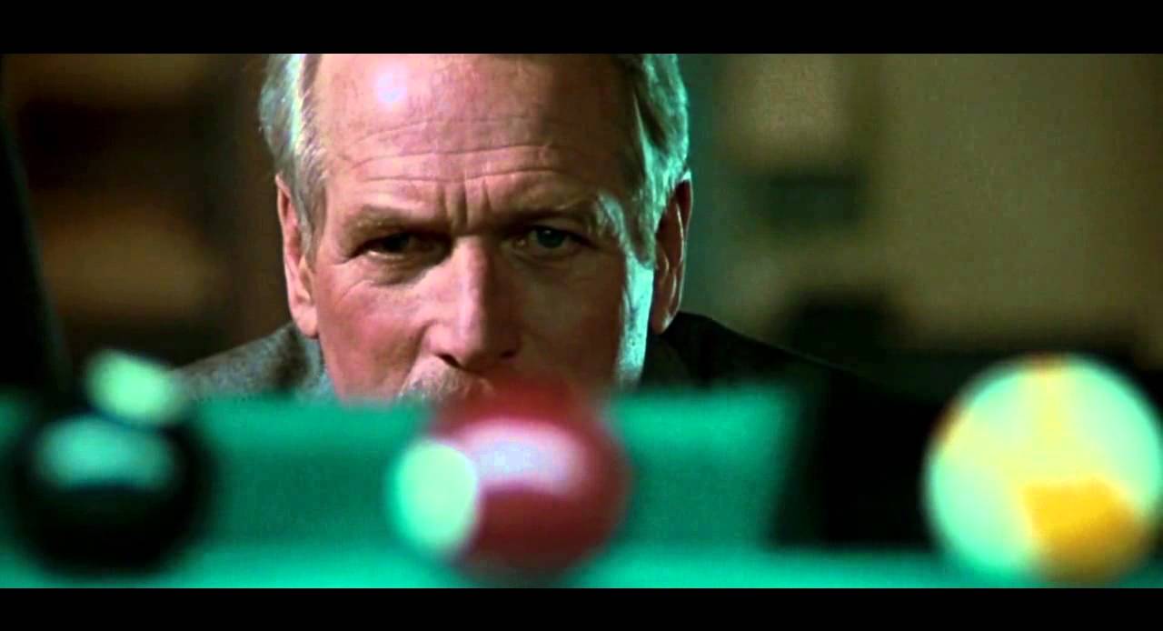
In the film, a sequel to Robert Rossen's 1961 classic The Hustler, retired pool shark Fast Eddie (Paul Newman) is slowing down but simultaneously trying to keep pace with the obnoxiously smug and hyperactive Vincent (Tom Cruise) who sparks some memory of his youth that he is desperate to recover.
In his attempt to both mentor and manipulate Vincent for his personal recalibration, Eddie suddenly finds himself vulnerable, reminded that just because he's travelled a long way down the road he can still find himself utterly lost.
Towards the end of the film, the ageing hustler returns close to his top form as he accepts a final challenge from Vincent, his young nemesis, at the only game of pool that now means anything to him.
His desire to reclaim what he's lost reminds me of Astrovision and my own need to remember what exactly it was that fired my heart all those decades ago before I became the battle-fatigued screenwriter I now am.
And then, perhaps, I can utter Fast Eddie's immortal parting line with the same "sledgehammer break" conviction as the great man himself.
"Hey, I'm back!"